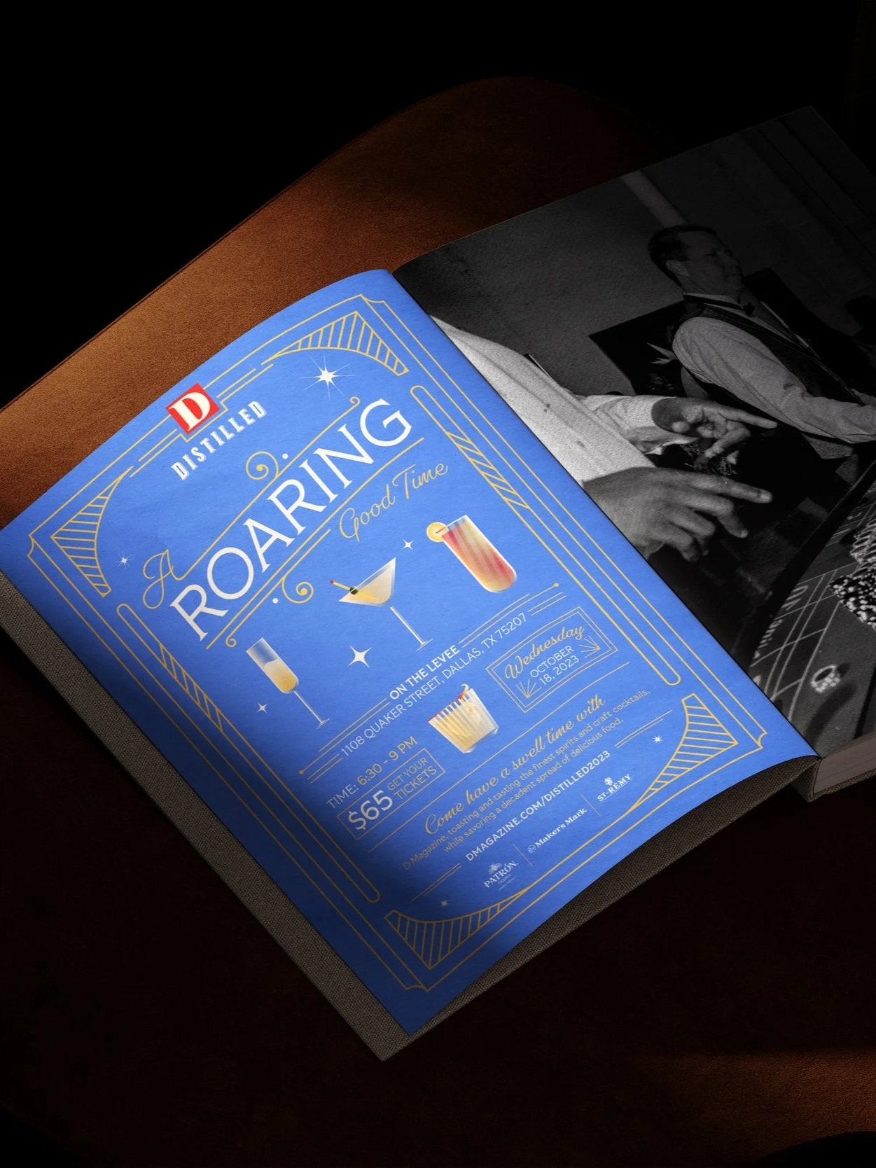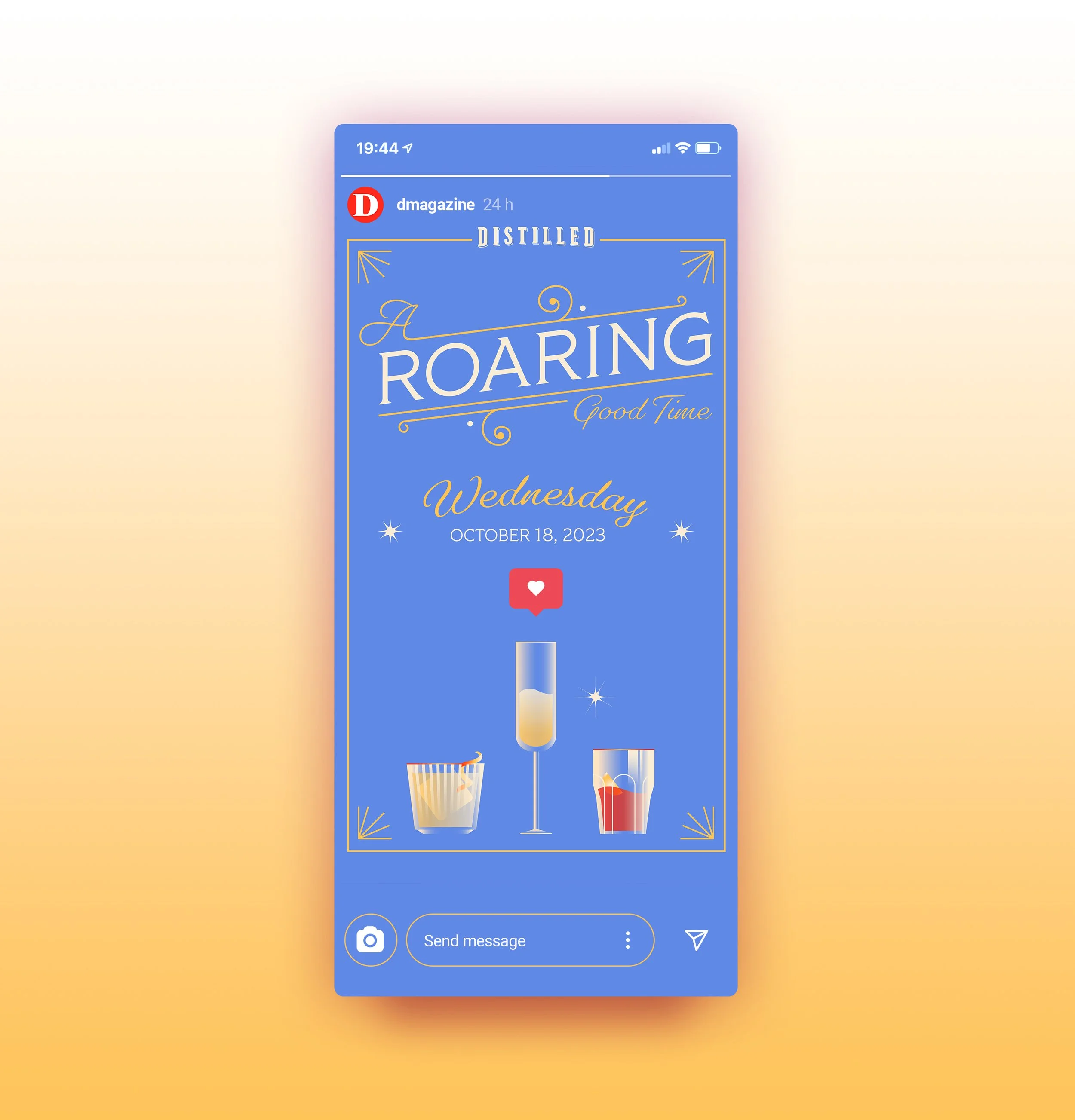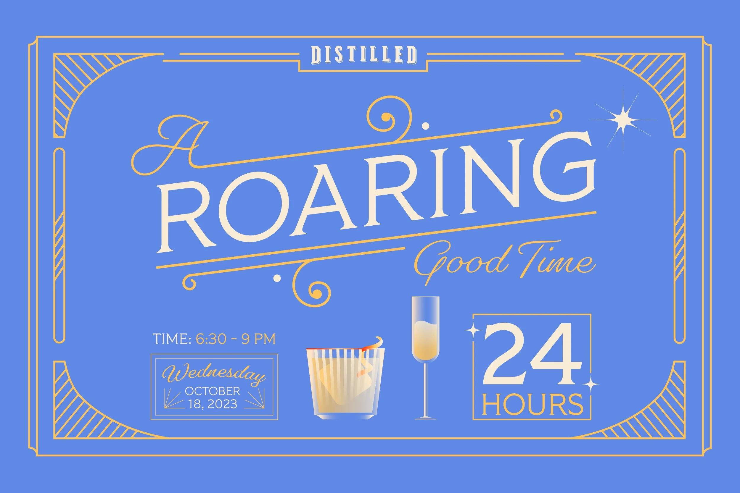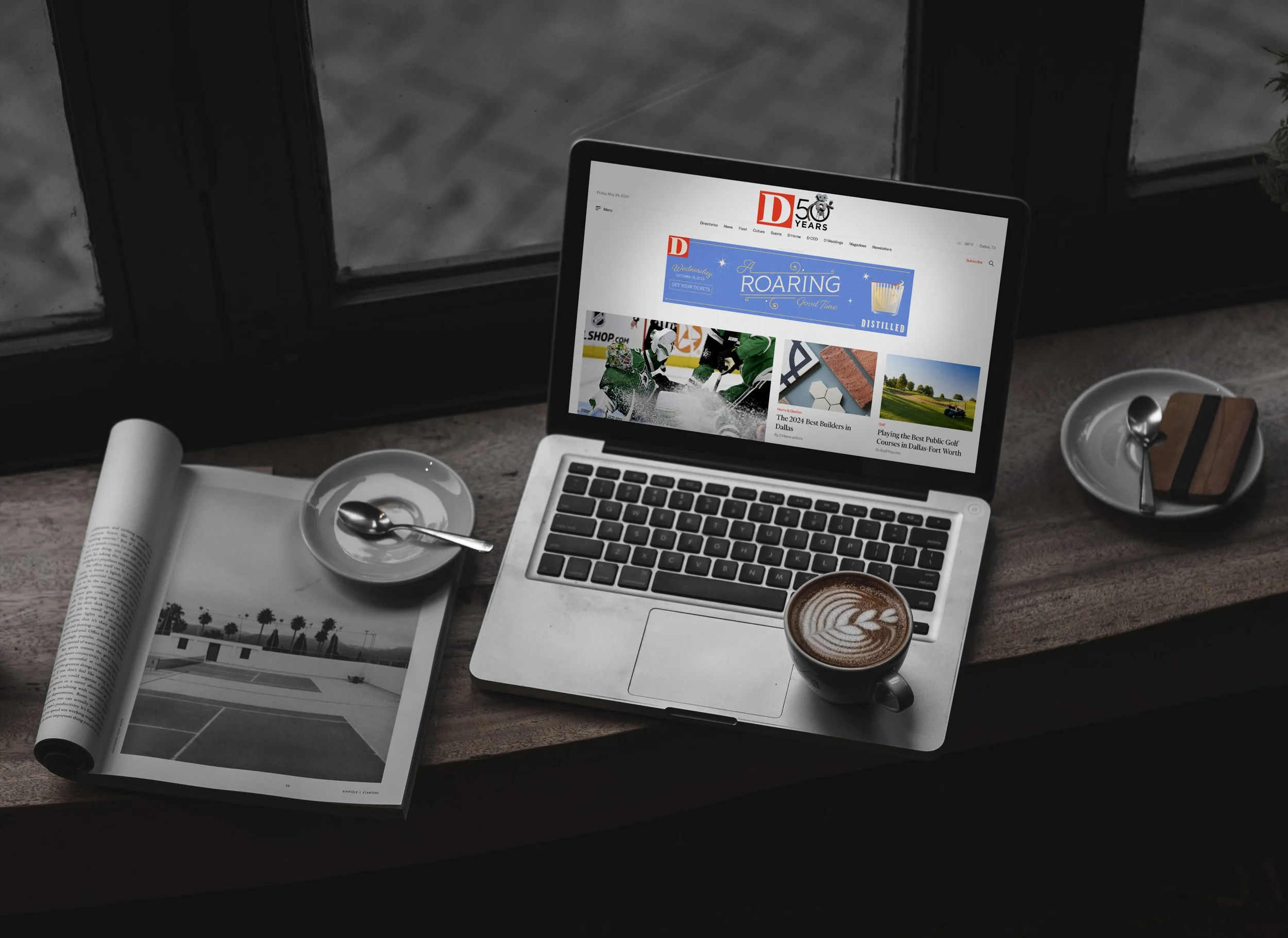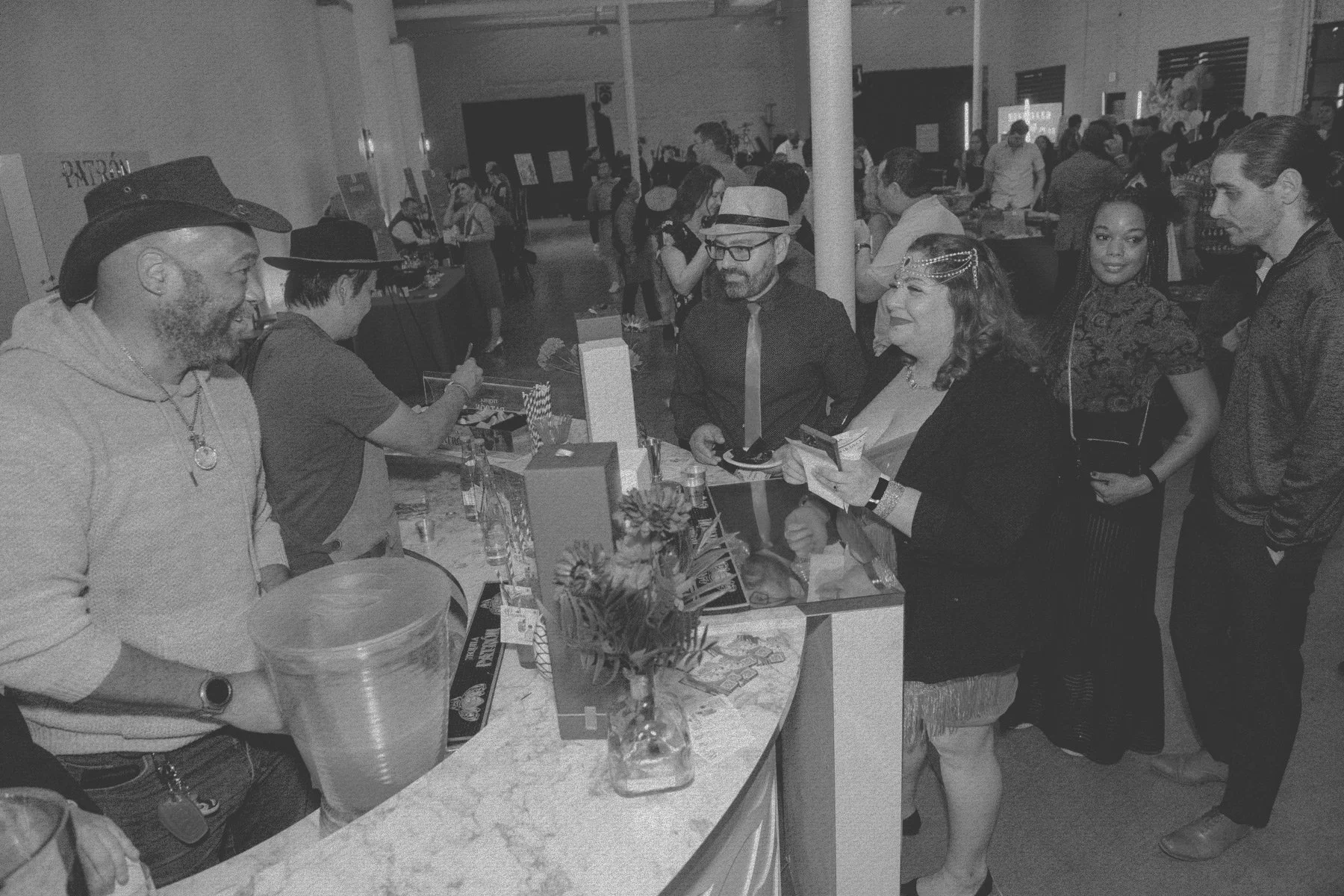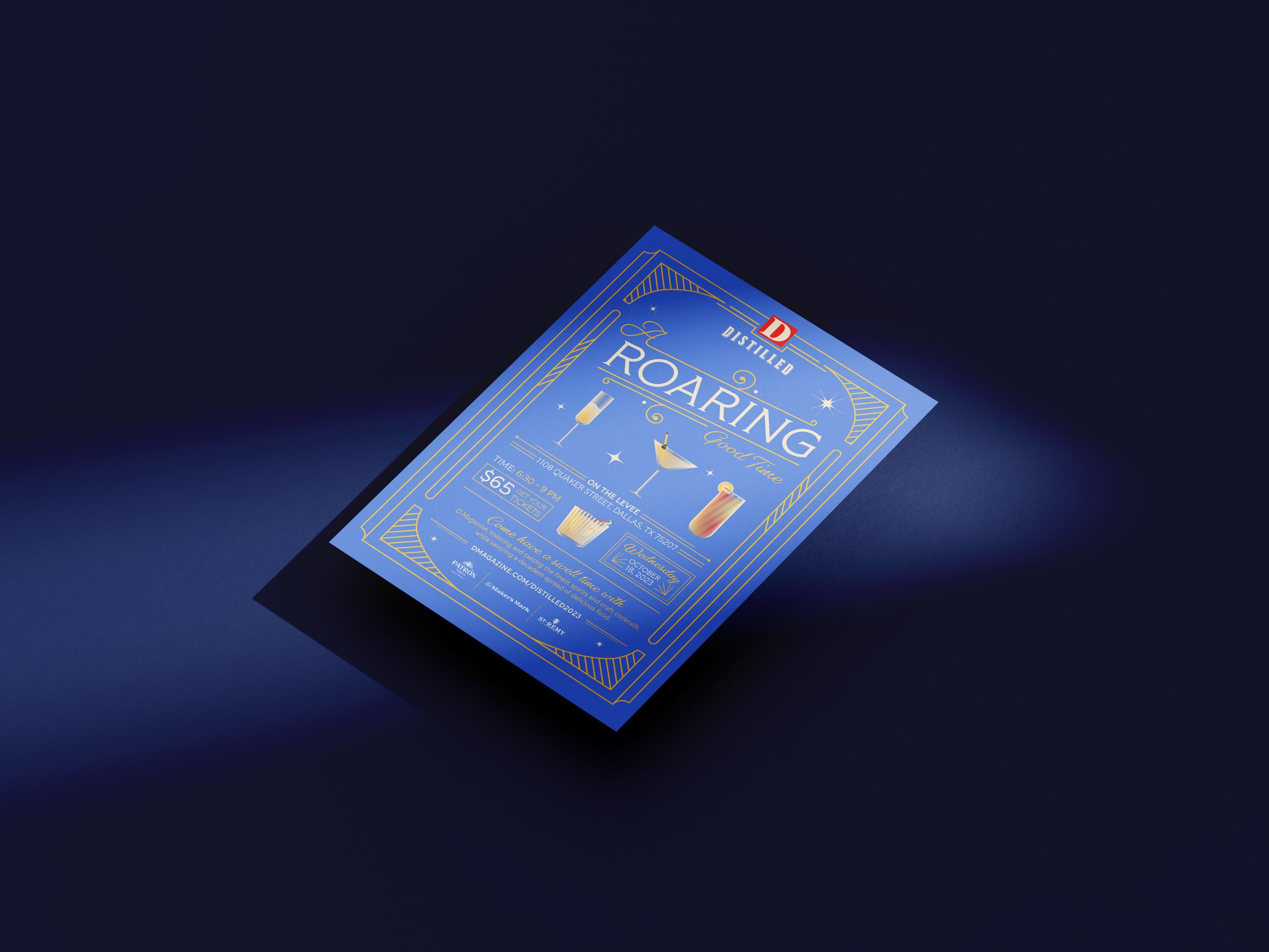
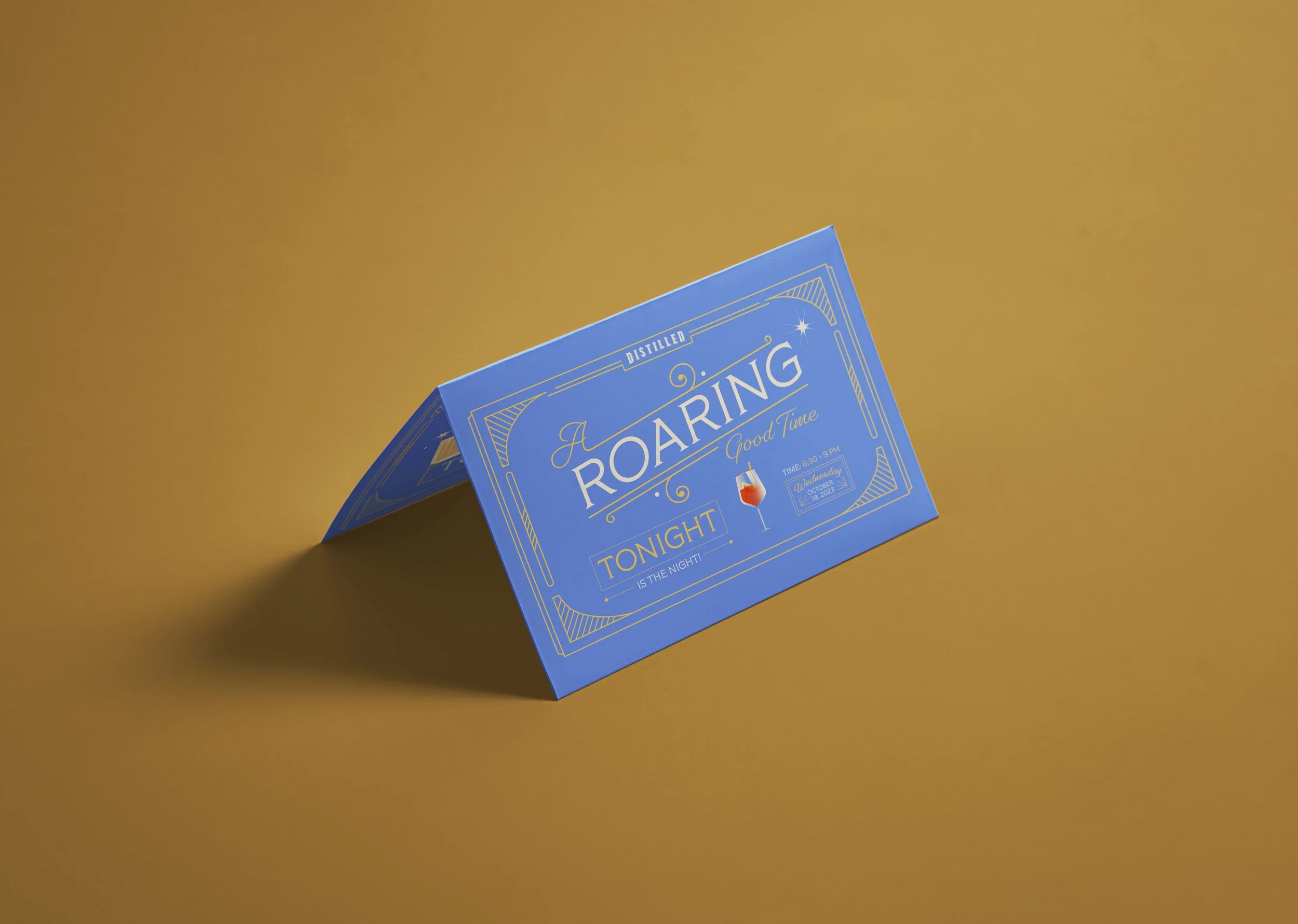
A Roaring Good Time
A Roaring Good Time is a D Magazine consumer event celebrating Texas spirits through an elevated cocktail experience inspired by the glamour of the 1920s Prohibition era. Drawing from Art Deco references, speakeasy culture, and refined typography, the visual identity reimagines the Roaring ’20s with a cleaner, more modern sensibility.
The goal was to create a look and feel that felt immersive and celebratory without leaning into cliché—balancing elegance and energy through considered typography, a refined color palette, and a flexible system designed to live seamlessly across platforms.
EVENT VISUAL IDENTITY BRANDINGDIGITAL MARKETING MATERIALSART DIRECTIONILLUSTRATIONTYPOGRAPHY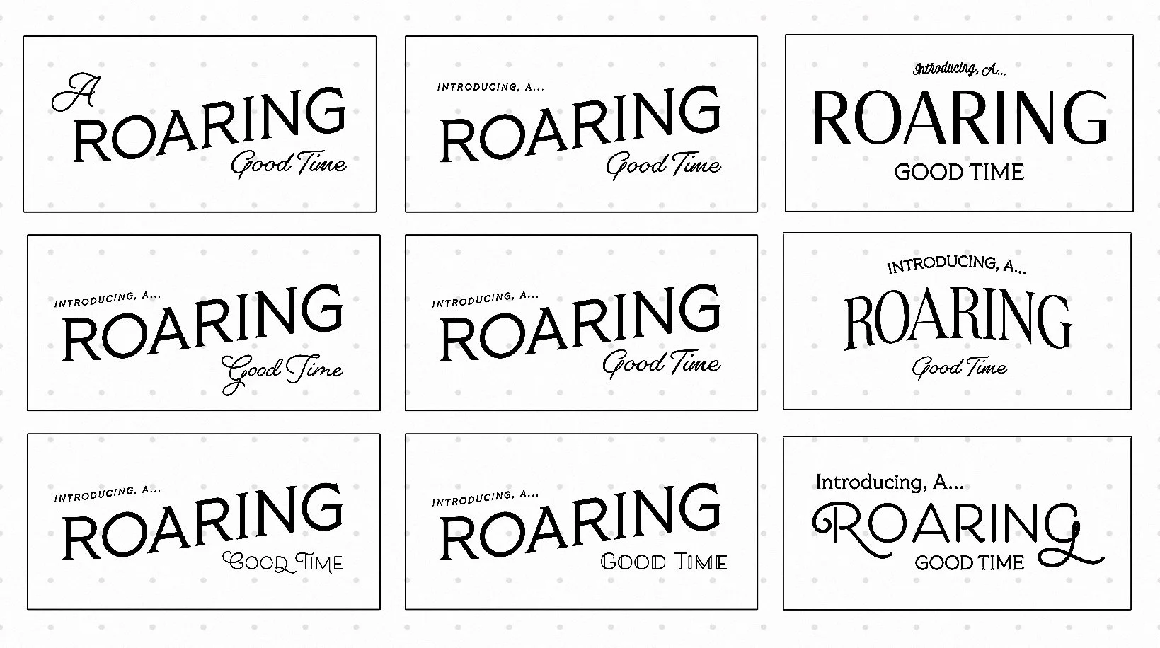
Final Typography Design
Through extensive color exploration, the final palette landed on a modern, inviting interpretation of Art Deco. Typography was refined to balance structure and movement—the primary type anchoring the system with strong, architectural lines, while the secondary font introduced subtle slants and decorative swirls to guide the eye. Together, the color and type lockup was designed to scale seamlessly across assets, adapting effortlessly from vertical to horizontal layouts.
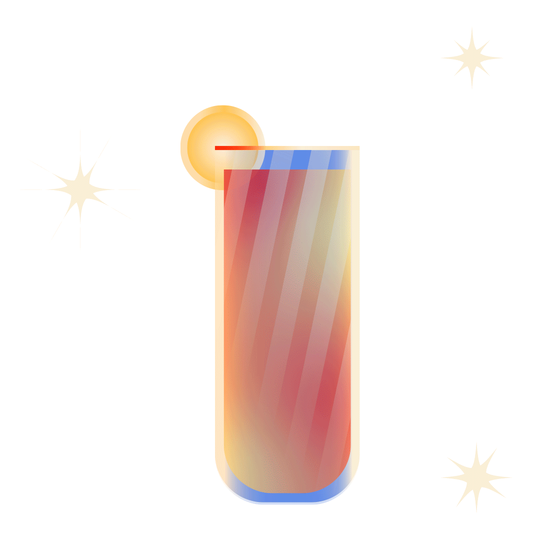
Cocktail Illustration Design
Distilled is a consumer event focused primarily on the finest top-shelf spirits. This sampling event ranged from tequila to whiskey to vodka. Each drink can be made and consumed in different cocktails which had to be shown in the event promotional design.